Team members

Niki
K&M team
Tools
- Paper
- Pen
- Invision
My responsibilities
- Discovery phase
- Feauture prioritization
- Sketches
- Prototype
- Test script
Duration
One week
The brief
I joined King & McGaw for a one week internship. We designed a new section for their website, where customers can buy custom-made frames.
Our approach
King & McGaw team decided that the best approach to design the new section for the website would be to use the 5 days sprint method (by Jake Knapp).
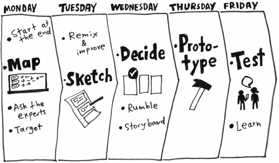
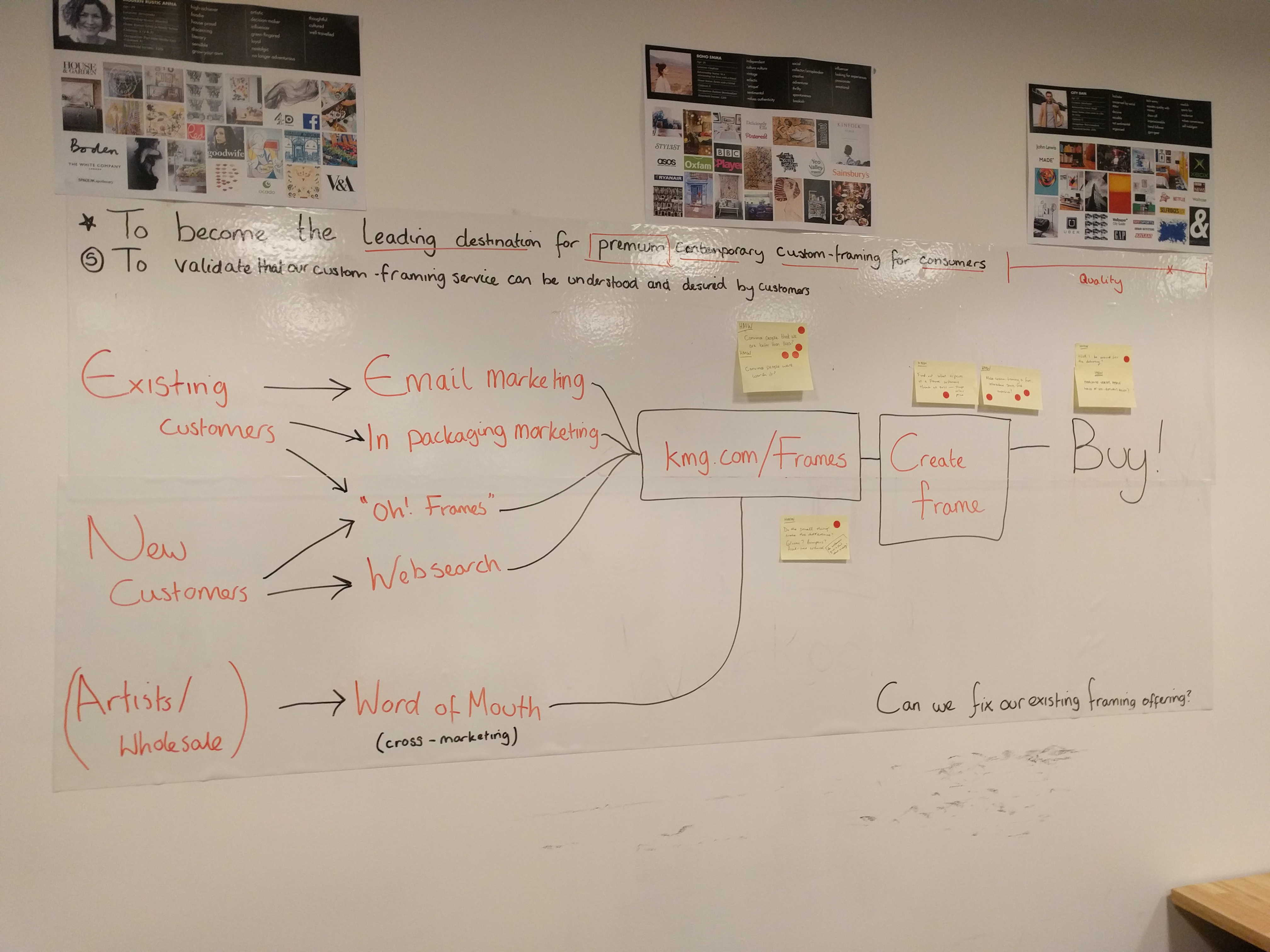
On the first day we concentrated on defining the problem and the opportunity. Working together we had to set a sprint goal but also a long term goal for the project.
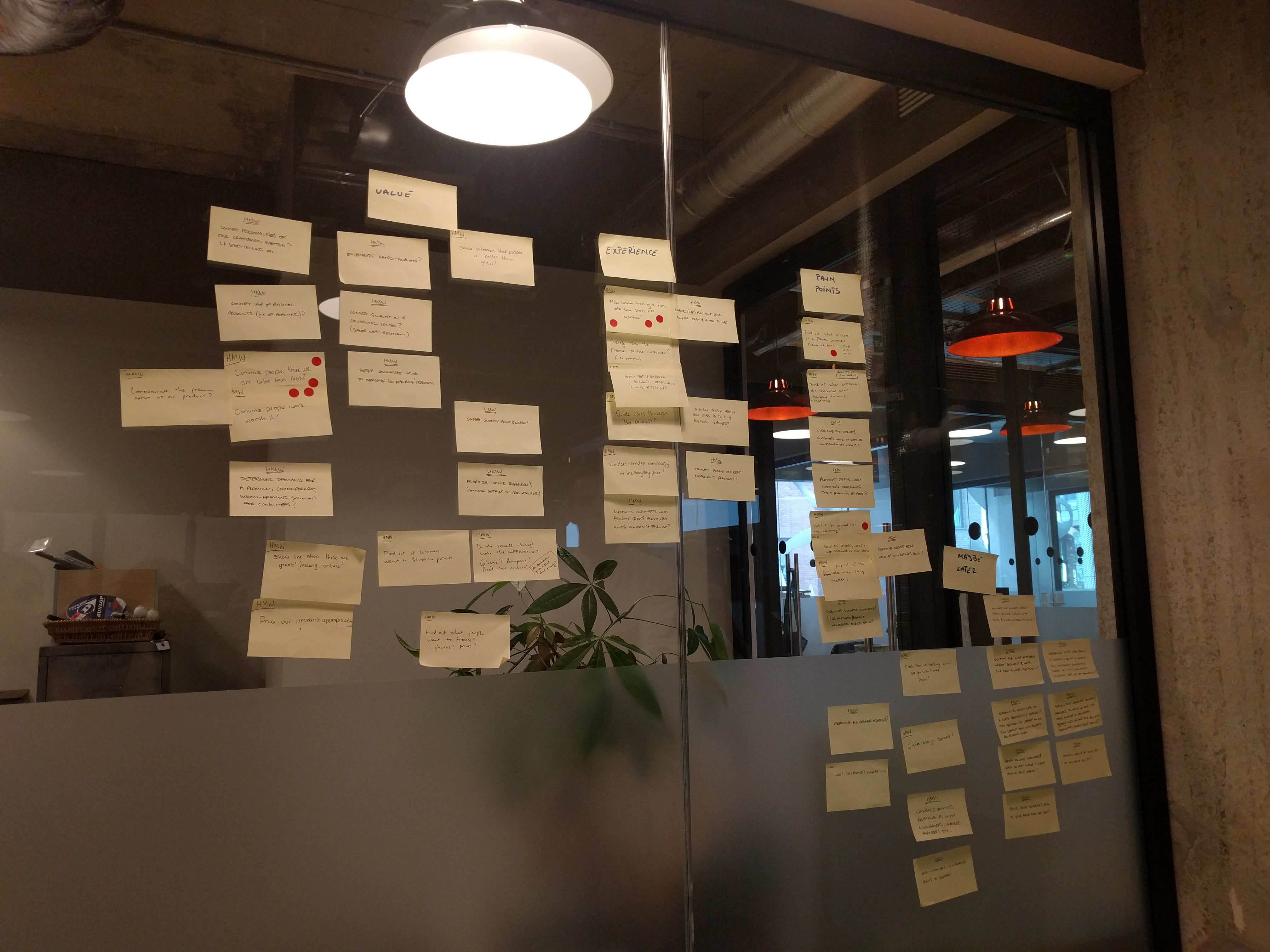
We used a method called "how might we" where we took notes on post-its and asked "how might we..." solve the problems we may encounter.
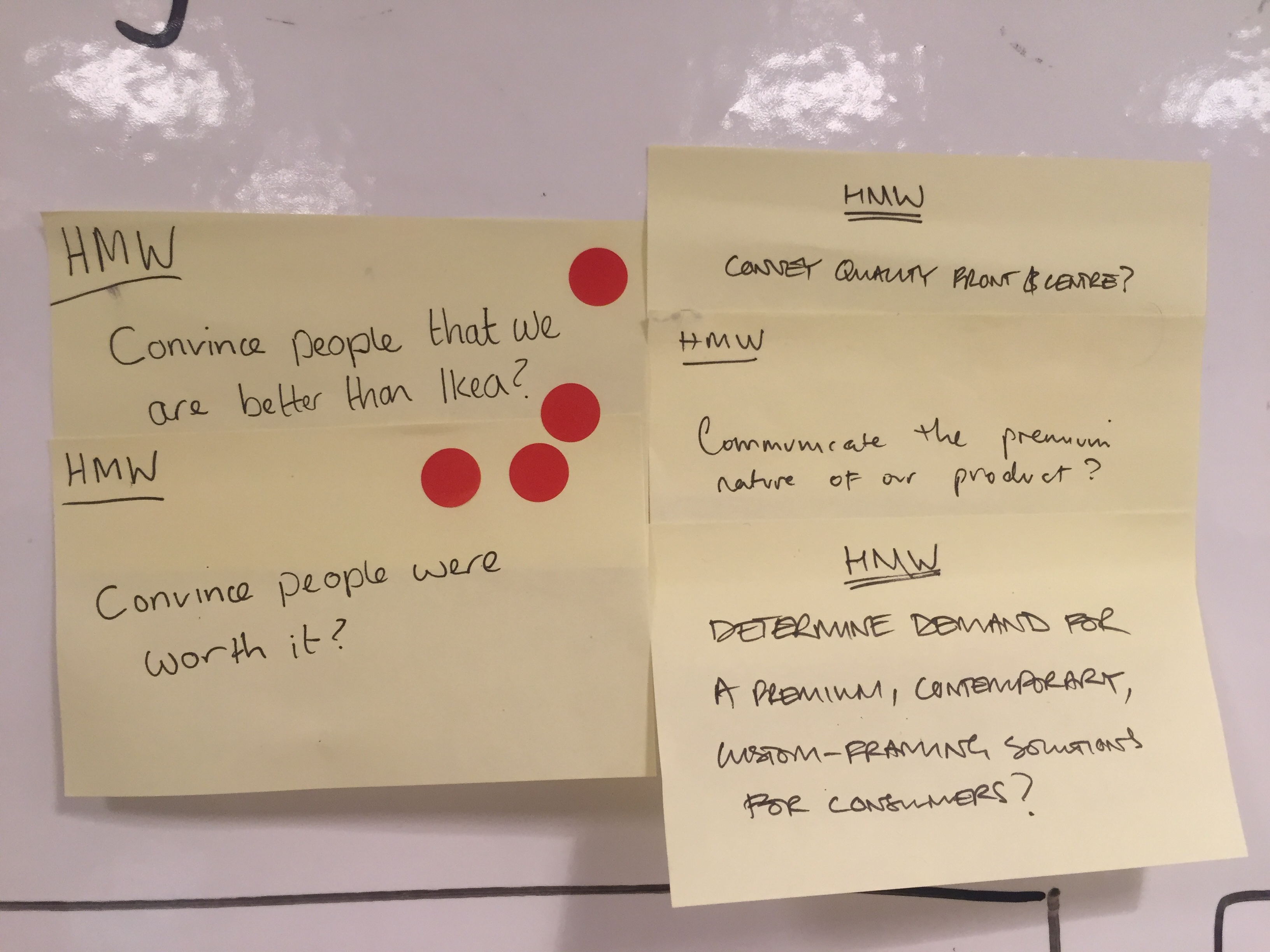
Everyone wrote their ideas individually. In the end we grouped everything in sections and we voted on the problems we thought we should solve in this 5 day sprint.
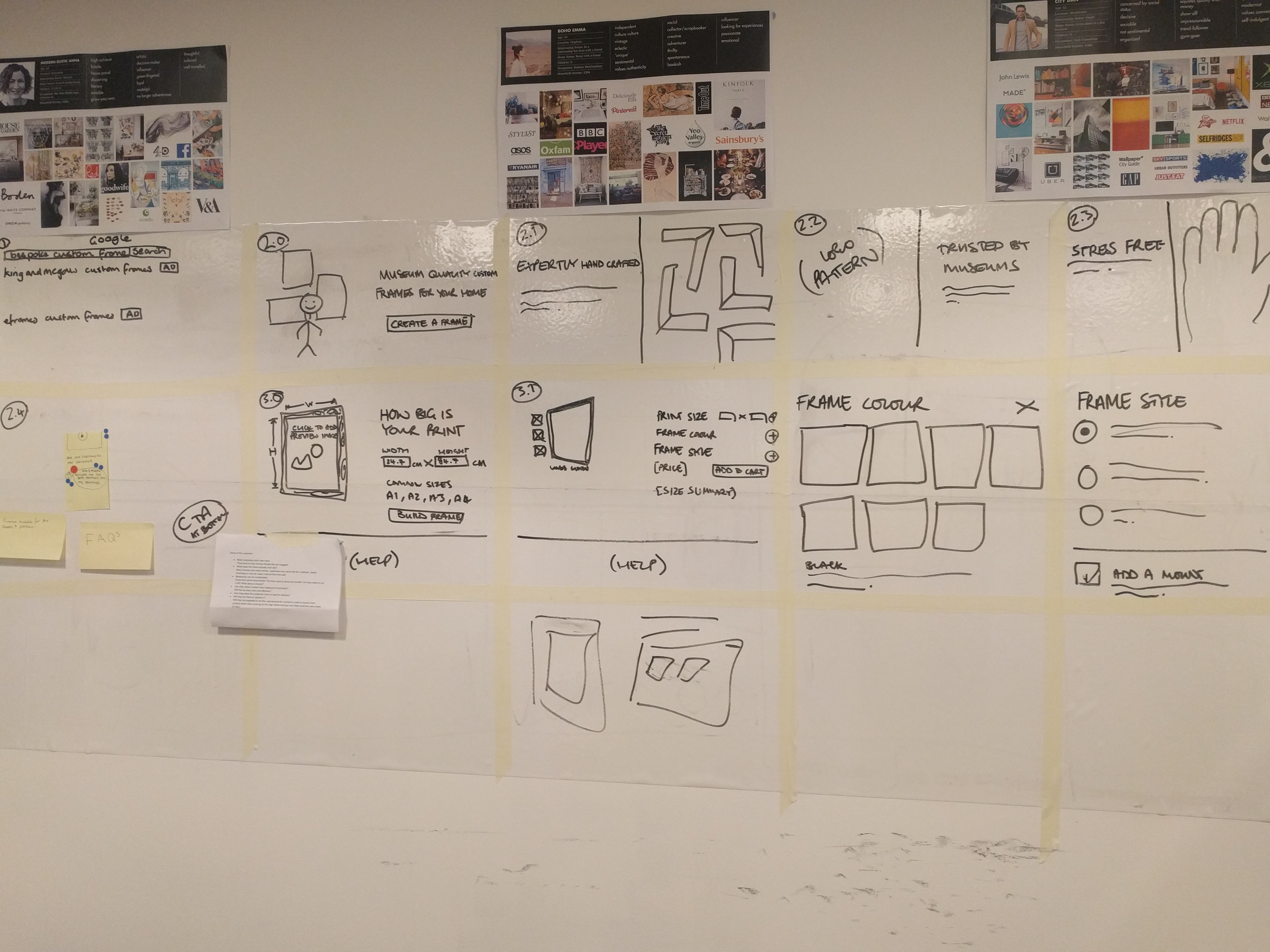
After evryone finished voting and choosing the problems, we needed to create a sprint map - by deciding our target group, how they land on the website and their journey on the website.
The process
We spent the second day looking at the competitors and sketching.
Each team member sketched 8 ideas of how the page might look like.
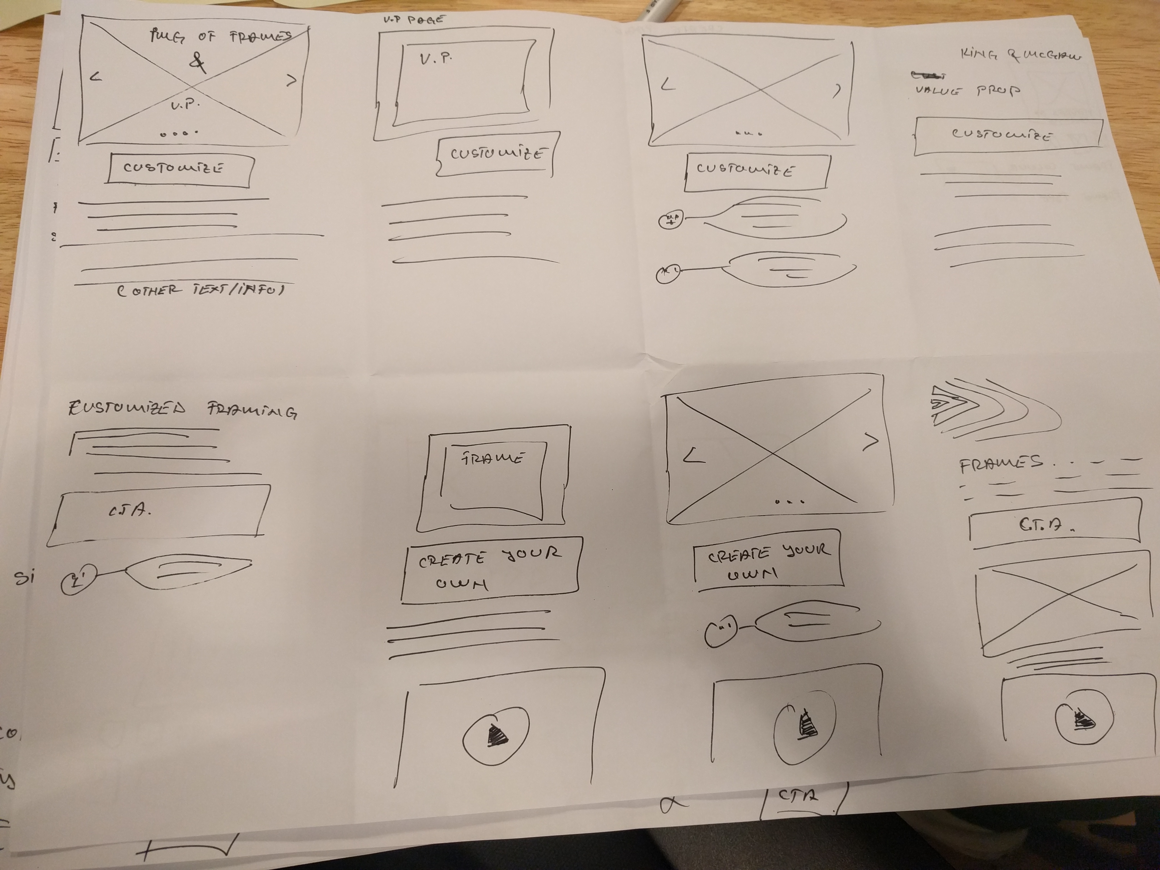
After that each team member sketched a new solution to combine every idea. Everyone did their sketching on their own and submitted the sketch anonymously.
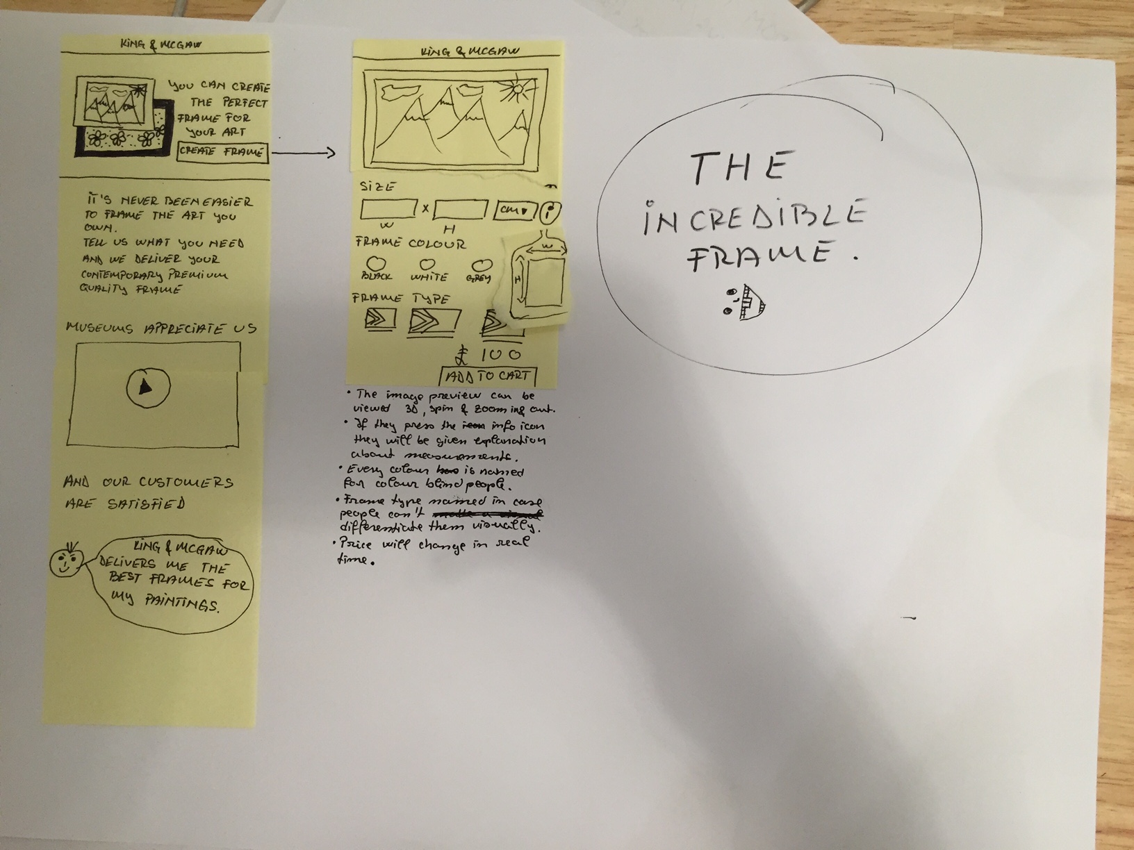
The next day we spent the day voting on the sketched ideas and solution and we created a final sketch together.
In the fourth day we created the mockups. The mockups were build by the other UX Designer working on the project and I was in charge on building the prototype.
The prototype can be viewed HERE
Outcomes
The prototype was tested with 5 users. The value proposition and messages about quality were not clear enough. Generally, the simplicity of the range (and corresponding simplicity of the design) seemed to be appreciated and people found the prototype easy to use.
The team worked on the project for two more weeks, in which they iterated and they started building the page.