Team members

Niki

Annelise
Jon

Dorota
Tools
- Sketch
- Omnigraffle
- Invision
My responsibilities
- User interview
- Personas
- User flows
- User journey
- Feauture prioritization
- Competitive analysis
- Sketches
- Mid-fidelity wireframes
- Mockups
- Usability testing
Duration
Two weeks
CONCEPT PROJECT
The following project is a concept project, which means no real clients were involved.
The brief
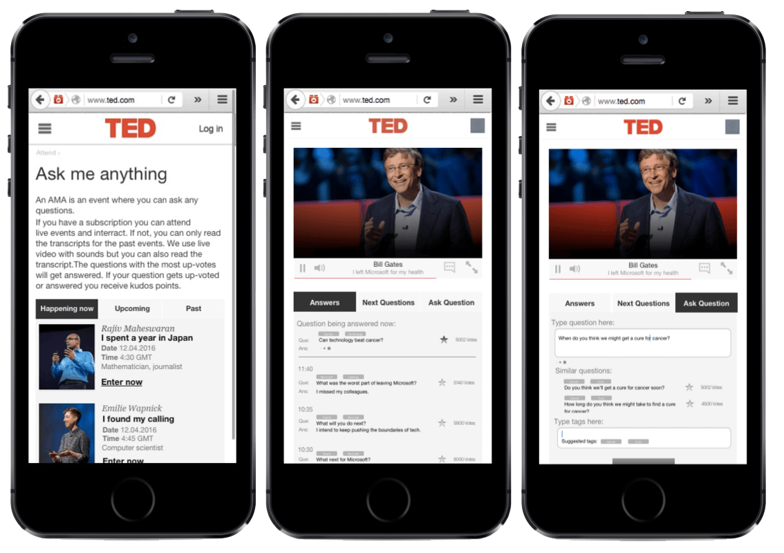
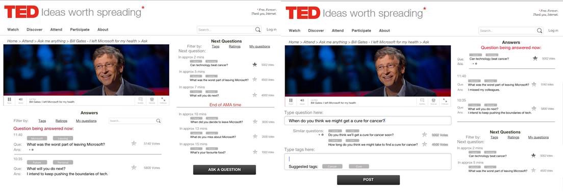
My team and I were tasked to add an Ask Me Anything (AMA) section to TED’s website and design a mobile responsive website.
Our approach
Our first step into understanding the problem was to see if and how other website are doing this. We analysed the competition and we found that most of them don’t have an Ask Me Anything section but they prefer to allow people to ask questions and receive answer from the community.
We also wanted to talk to the people that ask questions or search for answers online but also use TED.
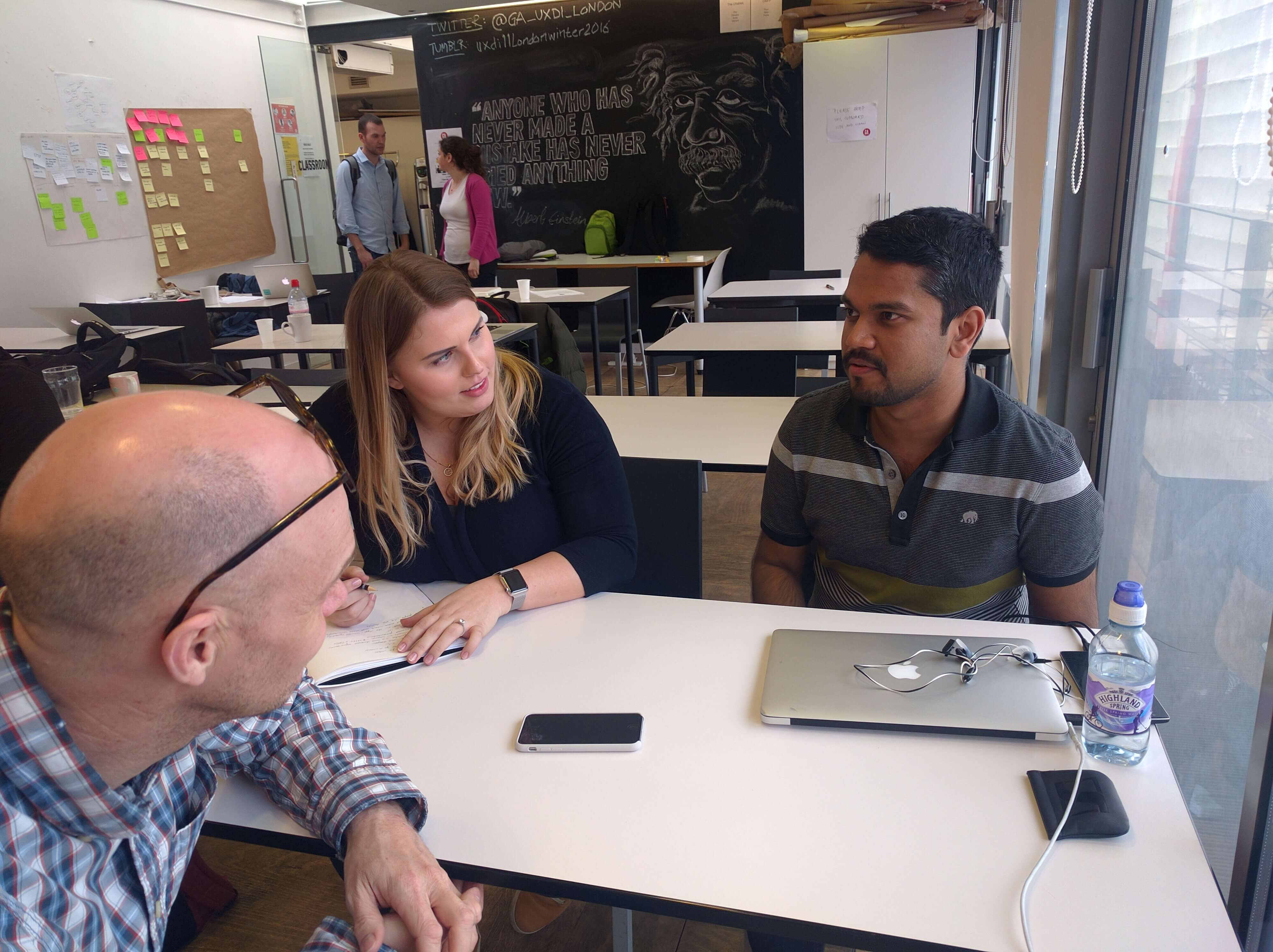
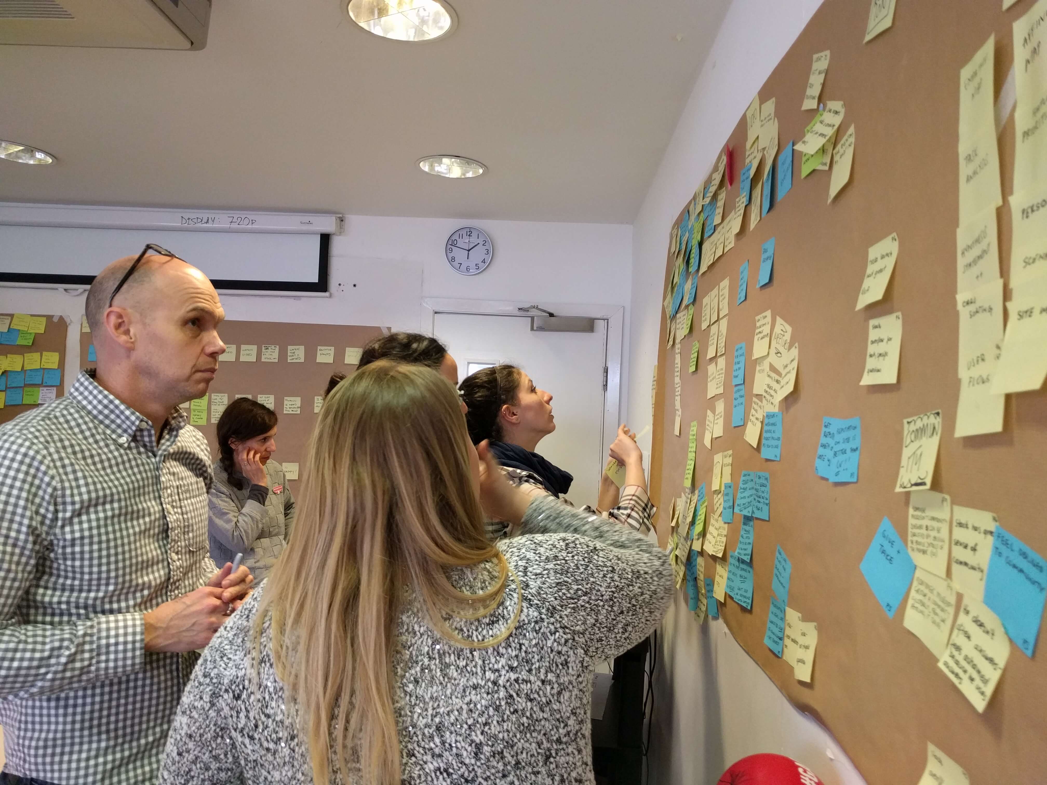
After we conducted the interviews we moved into mapping all the information we gathered from the interviews.
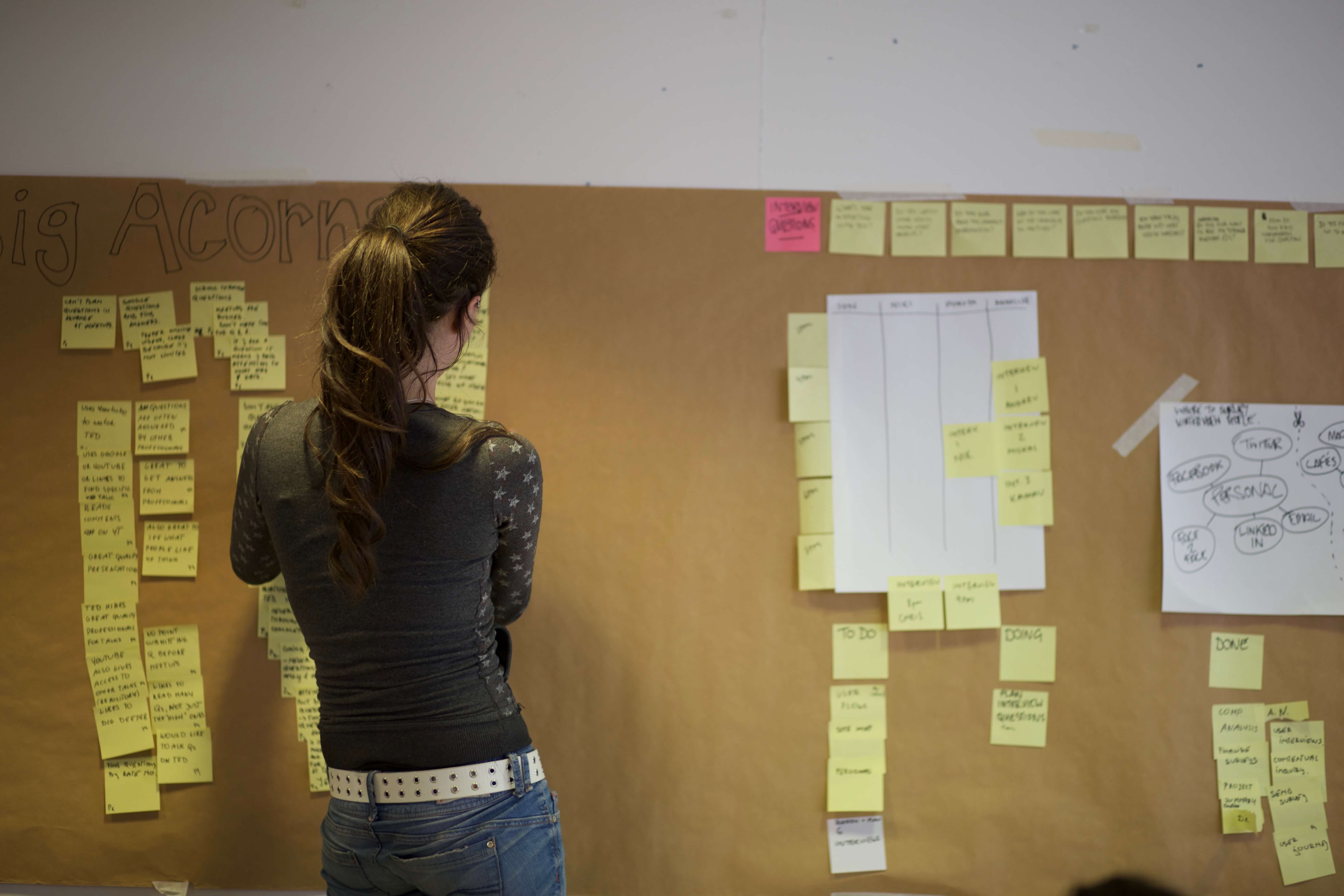
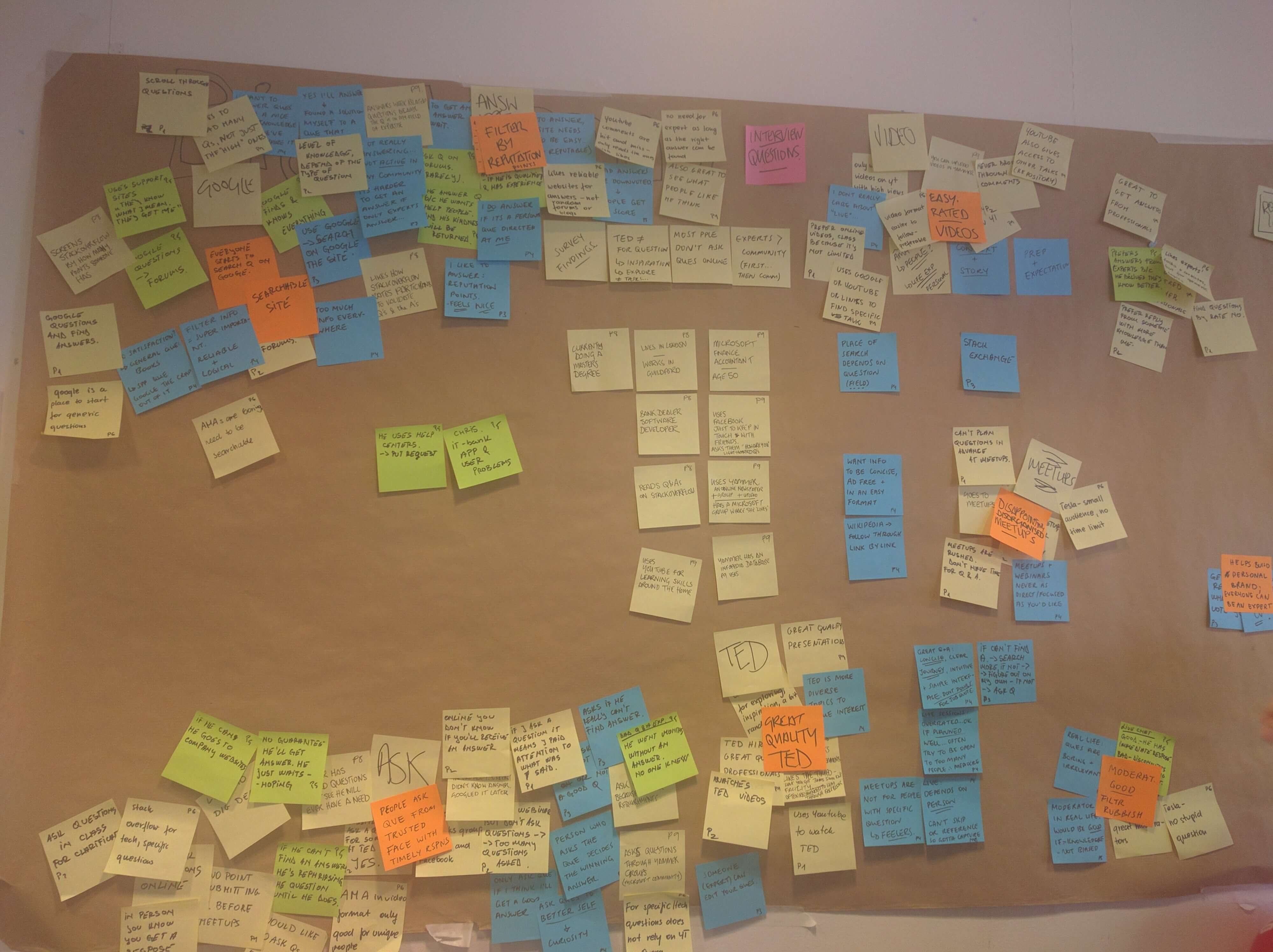
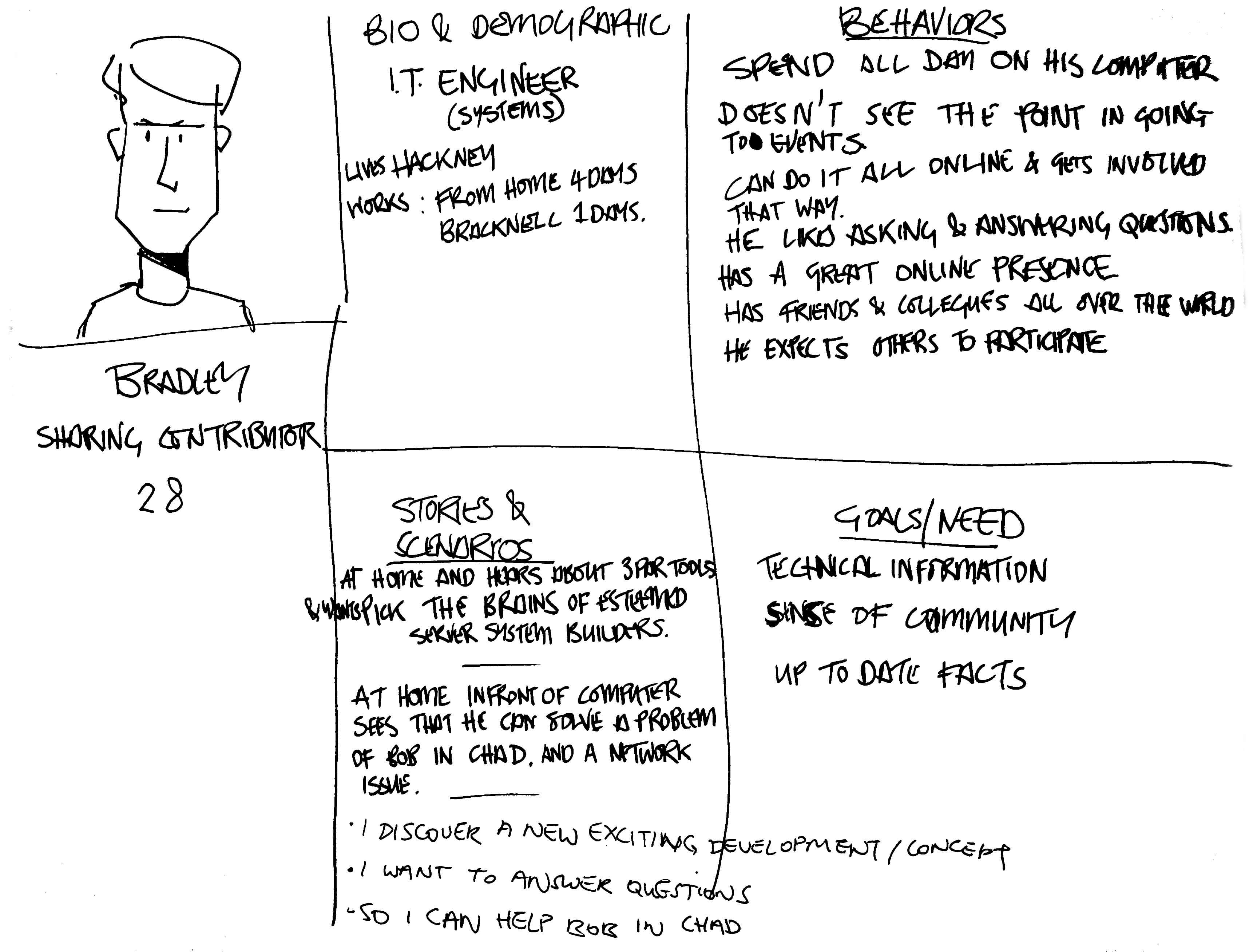
With this understanding of our users and the key insights we got from the user research we created personas to help us define our designs.
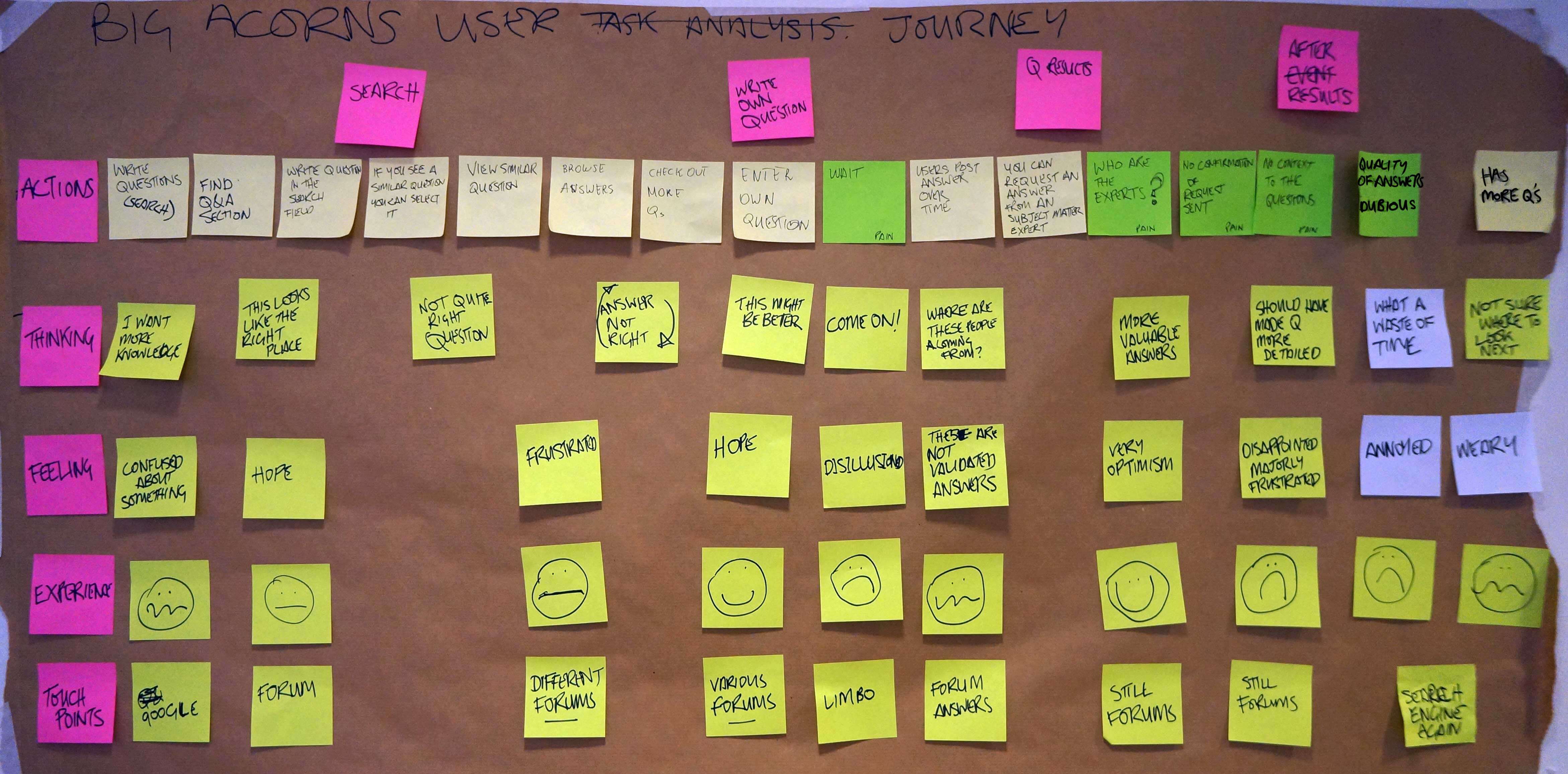
After we created our personas we wanted to see what's their current journey through the application.
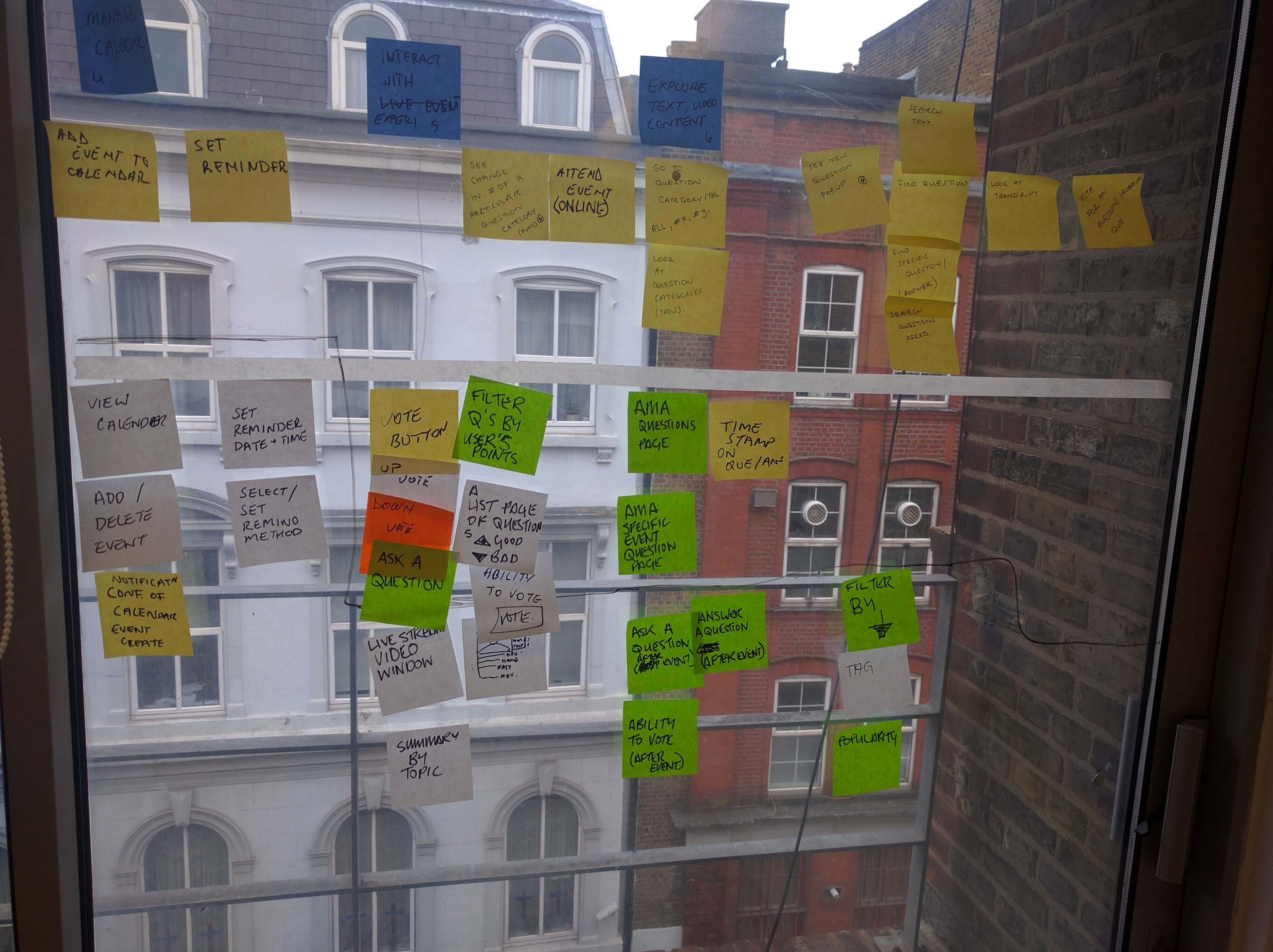
Before moving into the design phase we prioritized the feautures we should include in the AMA section.
The process
Having gathered all that information from users we could then move into the design phase. We started by brain-storming our ideas in a design studio.
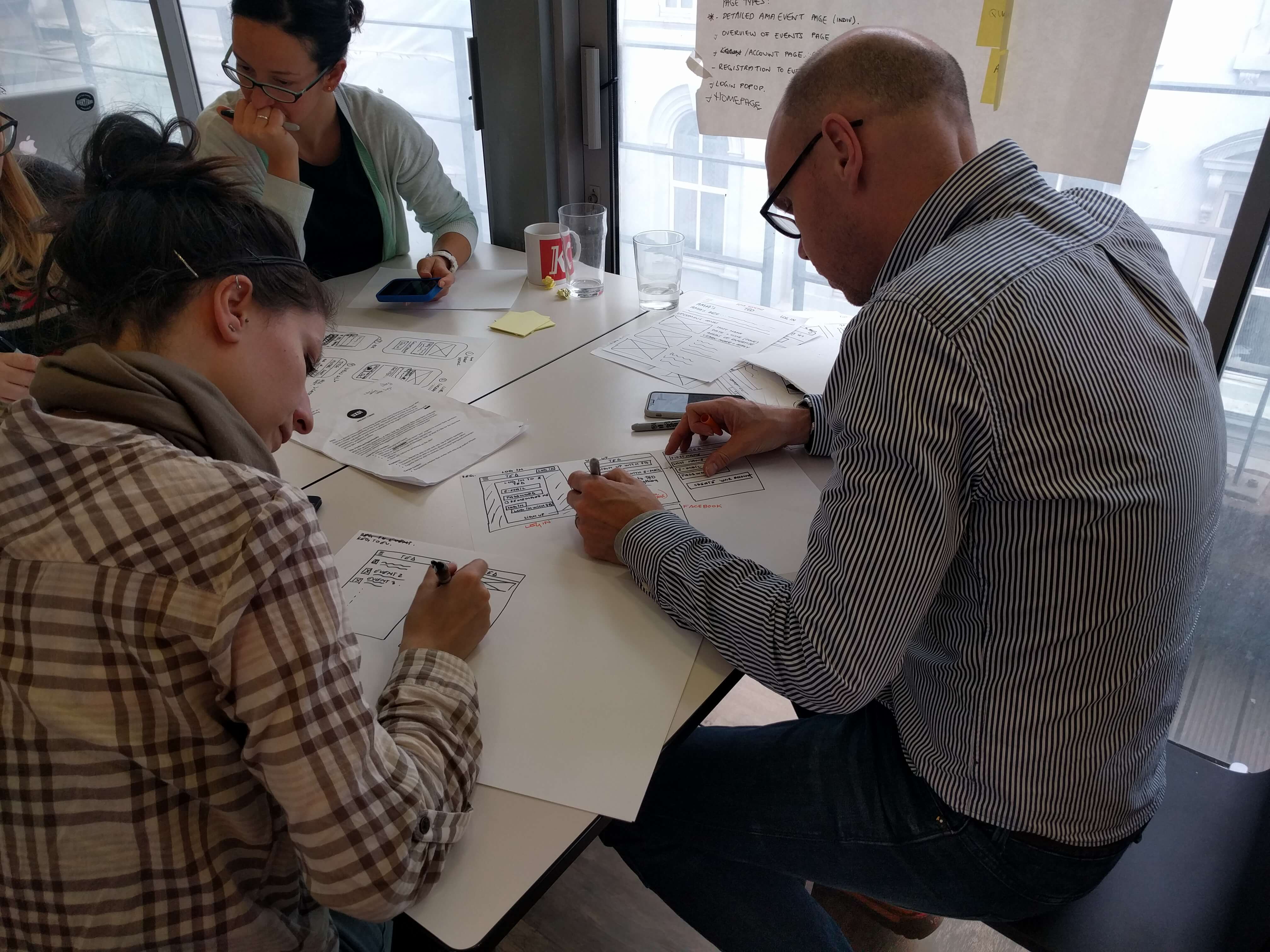
This is where our ideas started taking shape and we could now sketch our ideas and have a first idea of how the website will look like but also how it should work in order to allow the users to accomplish their goal.
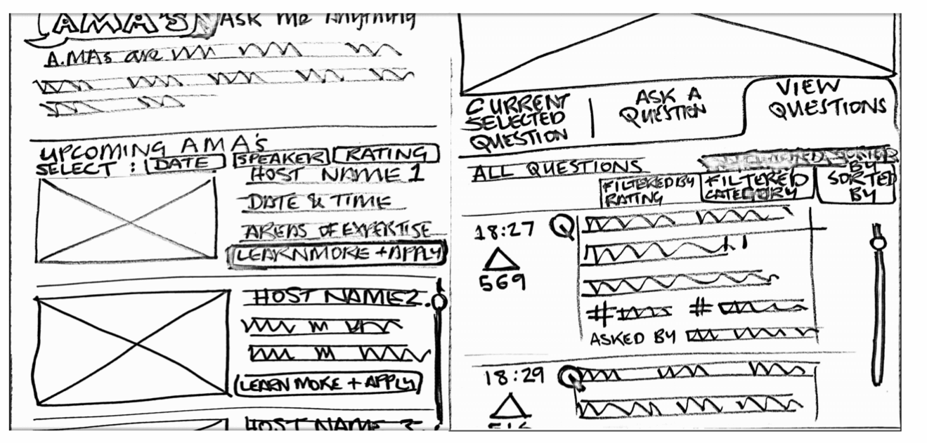
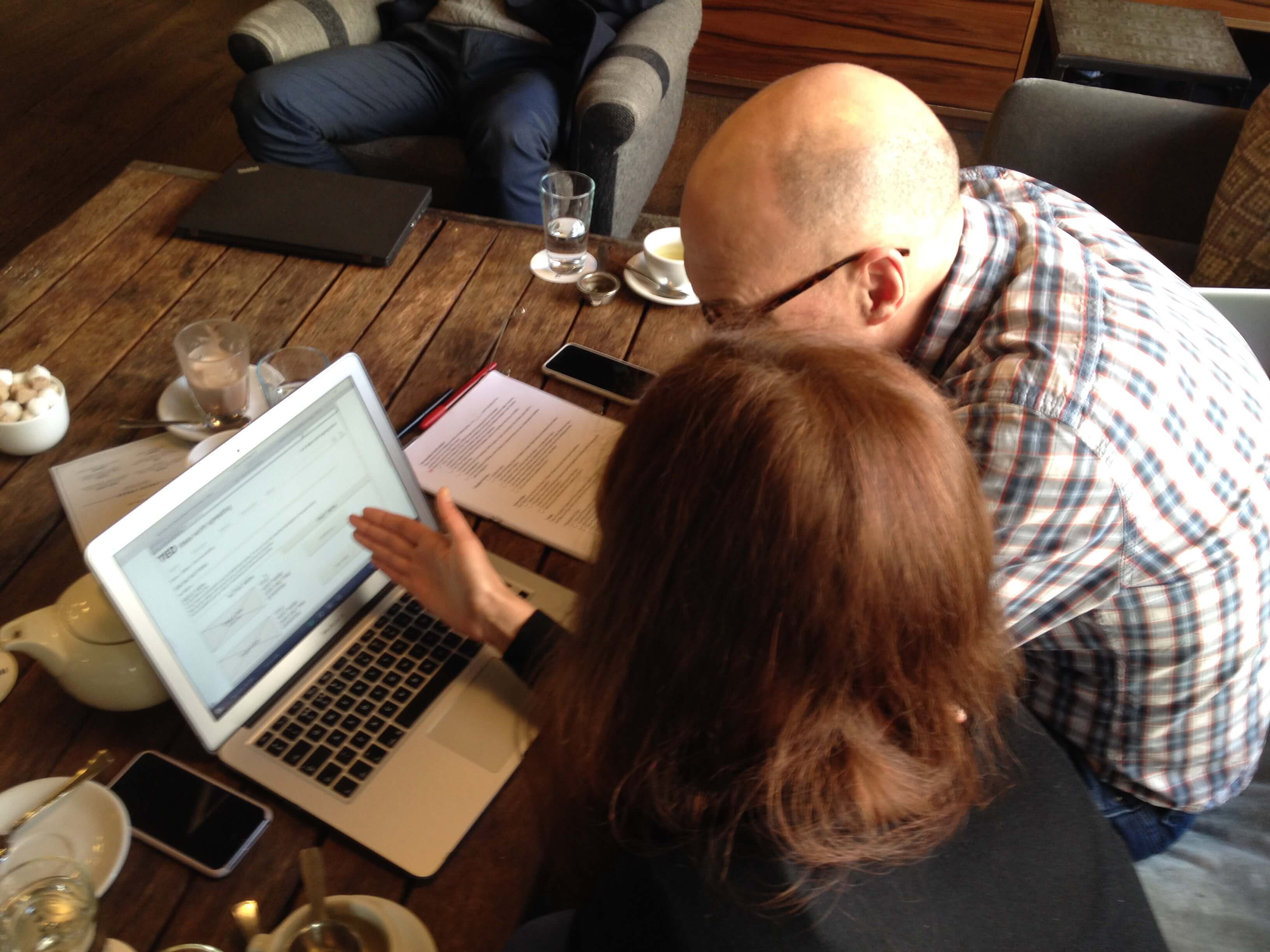
We tested our sketches. After we iterated our design we then did our mid-fidelity prototype. We used Omnigraffle to create the prototype, which we then tested again.
User testing confirmed that the premise for the project was well received and provided us with three key areas where we could iterate our design.
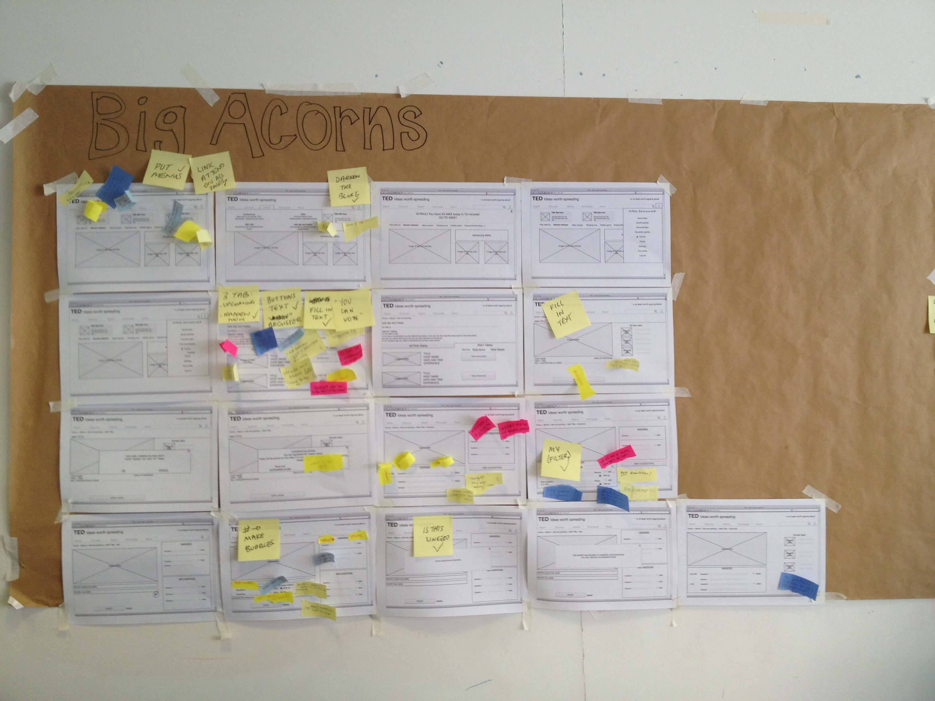
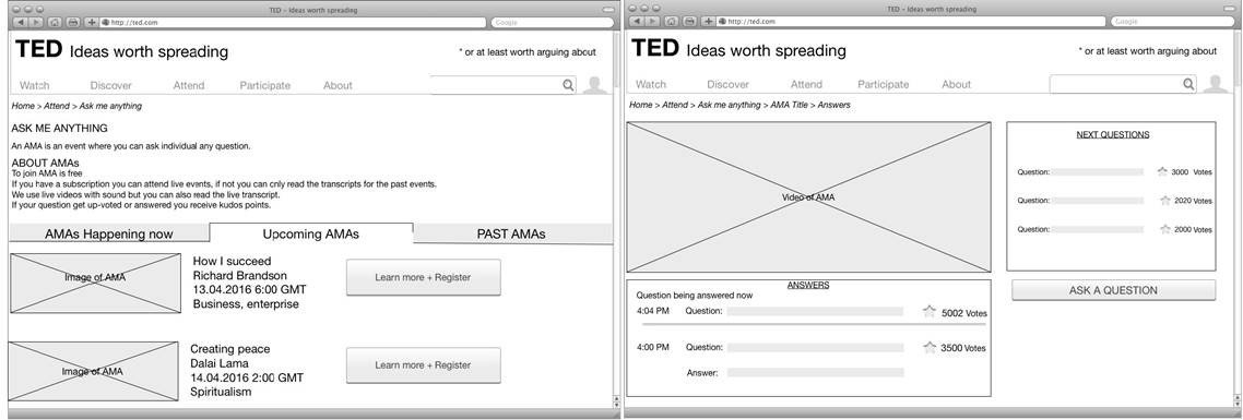
After a few round of tests and interations we created our mockups.
Outcomes
In the next sprint for this project, we’d like the opportunity to refine the visual design of elements such as the voting and tagging systems. Though the design was intuitive enough for some users, others were a little confused. By highlighting their desire not to miss an AMA event they’d registered for, users inspired an idea within the team to perhaps integrate with calendar service providers. If the TED AMA events are going to be a desirable event that people will pay and register for, then users would want a reminder in their existing digital calendars.